Web App
iSTART Early
A Research based Gamified Learning Platform for young students for improving comprehension skills.
Role
UX Designer & Researcher
Team
Stakeholder, Product Owner, Software Developer, UX Designer
Tools
Figma, Illustrator, DiceBear Library
Duration
20 Weeks
Live Link

ARFES
Ask It
Reword It
Find It
Explain It
Sumarize It
Highlights
Assignment
Assignment
Assignment
+34%
Assignment click through rate

+78%
Avatar Interaction

+86%
Task completion rate
Problem Statement
I identified iSTART-Early had several engagement challenges, making it difficult to stay motivated and less personalized in students learning journey.
After reviewing and gathering team feedback, I came up with core challenge and three key issues.
Core Challenge
How might we increase student engagement by enabling personalization, creating engaging interactions, and simplifying navigation across learning activities?
Avatar & Shop System
Existing system wasn't inclusive and had limitations that restricted personalization.
Dashboard
felt lifeless, failed to create emotional engagement for students.
Station Navigation
Students struggled to differentiate between lesson, practice, assignment and game.
Avatar & Shop System
Challenge
The existing avatar system presented multiple critical usability and engagement issues

fig. Previous Avatar & Shop
Research Phase
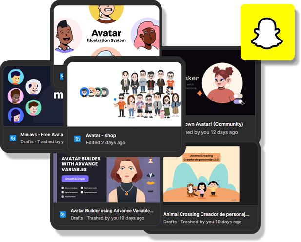
Analyzed 20+ avatar systems & React Libraries
Conducted competitive analysis with Snapchat's Memoji feature as a gold standard
Stakeholder & PO Collaboration
Presented findings to stakeholders and selected Avatar-Shop for its full-body avatar collection and after pivot to dicebear library.

Design Decision Thinking
My design philosophy was

Solution Phase 1
I began with a library of 100 full‑body characters and a mandate to make avatars
Playful
Diverse
Performant in angular
In library, every avatar shared 3 consistent groups head, torso, limbs and for that I used Figma components to swap parts and validate that cross‑mixing looked natural.


Limitations that surfaced & Why we pivoted
We pivoted because the misalignment risk and maintenance cost of images in Phase 1 were too high.
Certain accessories (balloons, hats etc.) wouldn’t align predictably across mixes. Even with standardized names, the raster assets made the system fragile, a small swap could break the composition.
Phase 2
We recommended a pivot to DiceBear’s SVG avatar system for consistency, performance, and modularity.
then I Redesigned, kid‑friendly flow.
Organized tabs based on cognitive load


Smart color picker
Default palettes for quick choices avoiding Kids confusion for color picker.
Clear states: Locked/unlocked/selected
considering inclusivity and color contrast for locked icons.

iBucks economy
Explicit feedback for insufficient funds, discard, reset, and save with large tap targets.
on Layout I decided to have a live Preview on the left and an Edit panel on the right. Changes update instantly, so students see cause-and-effect without losing context.

Results
Increased avatar interaction by 78%
Expanded inclusive customization options
Improved task completion by 86%
Reduced friction in customization flows
Created a more scalable avatar system