Park Signage Design
STEAM Signage
ROLE
UX Researcher / Designer
Date
Fall 2024
Duration
10 Weeks
Project Description
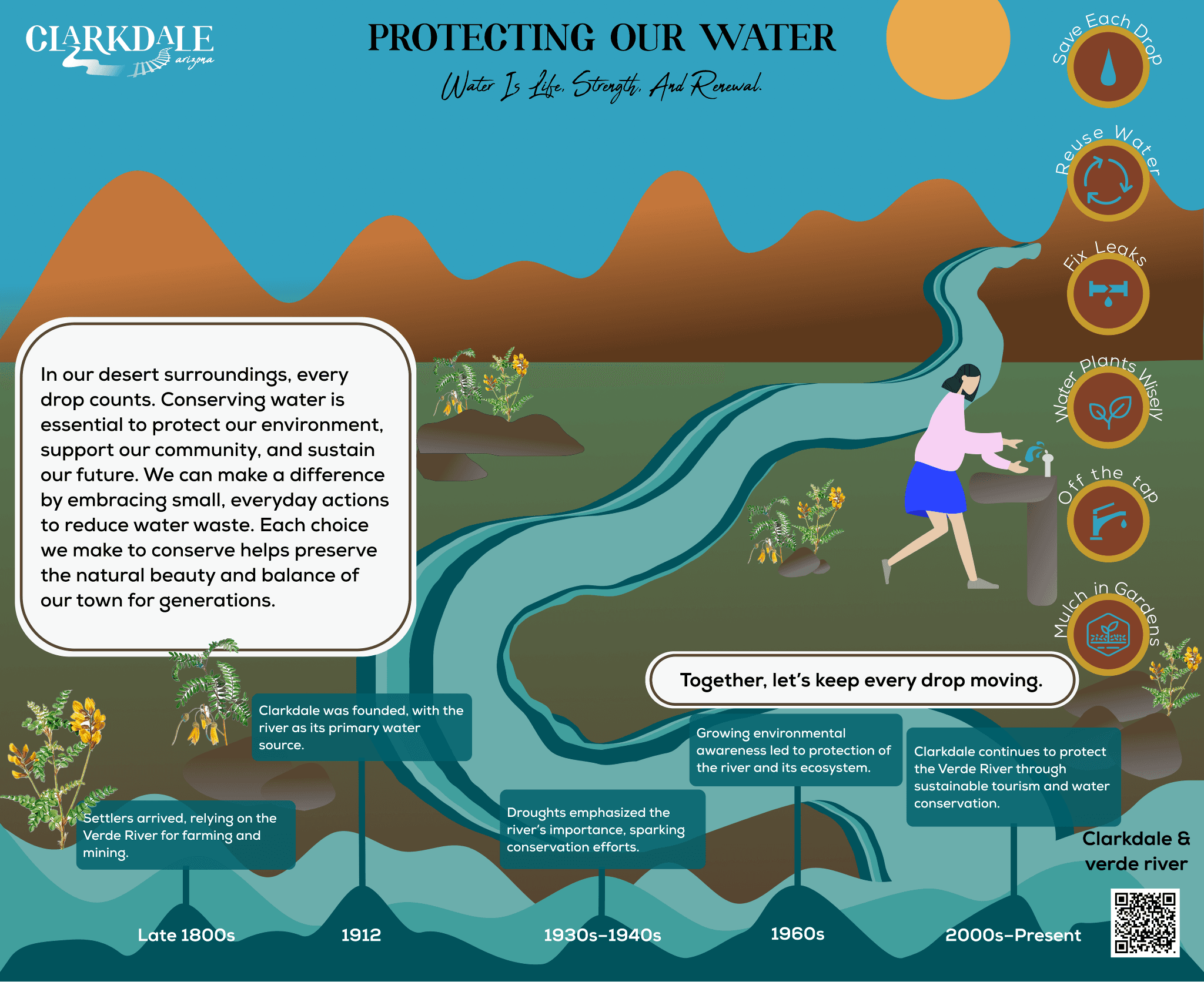
I designed educational signage for the $2.5 million renovation of Selna Mongini Park in Clarkdale, Arizona. The signs foster community connection and environmental stewardship, making STEAM learning a playful experience for visitors of all ages.
As a grad student, I was enrolled in TWC (technical communication) class #MyFirstGradClass, I was introduced that we will be colaborating with team of selina mongini park in clarkdale AZ, and they were going under the $2.5 million renovation of the park for the local community, and they had some requirements that the park will be focusing on the steam(Science,technology,engineering,arts, mathamatics) learning for all the visitors, so all of the students were teamed up in different focus areas and I choose "Arts" because I wanted to be creative. they gave some key aspectcts that were expectiong form team Arts, they wanted to represent native history and the importance of verde river that is very close to that town, that feeded the local people, all these information .
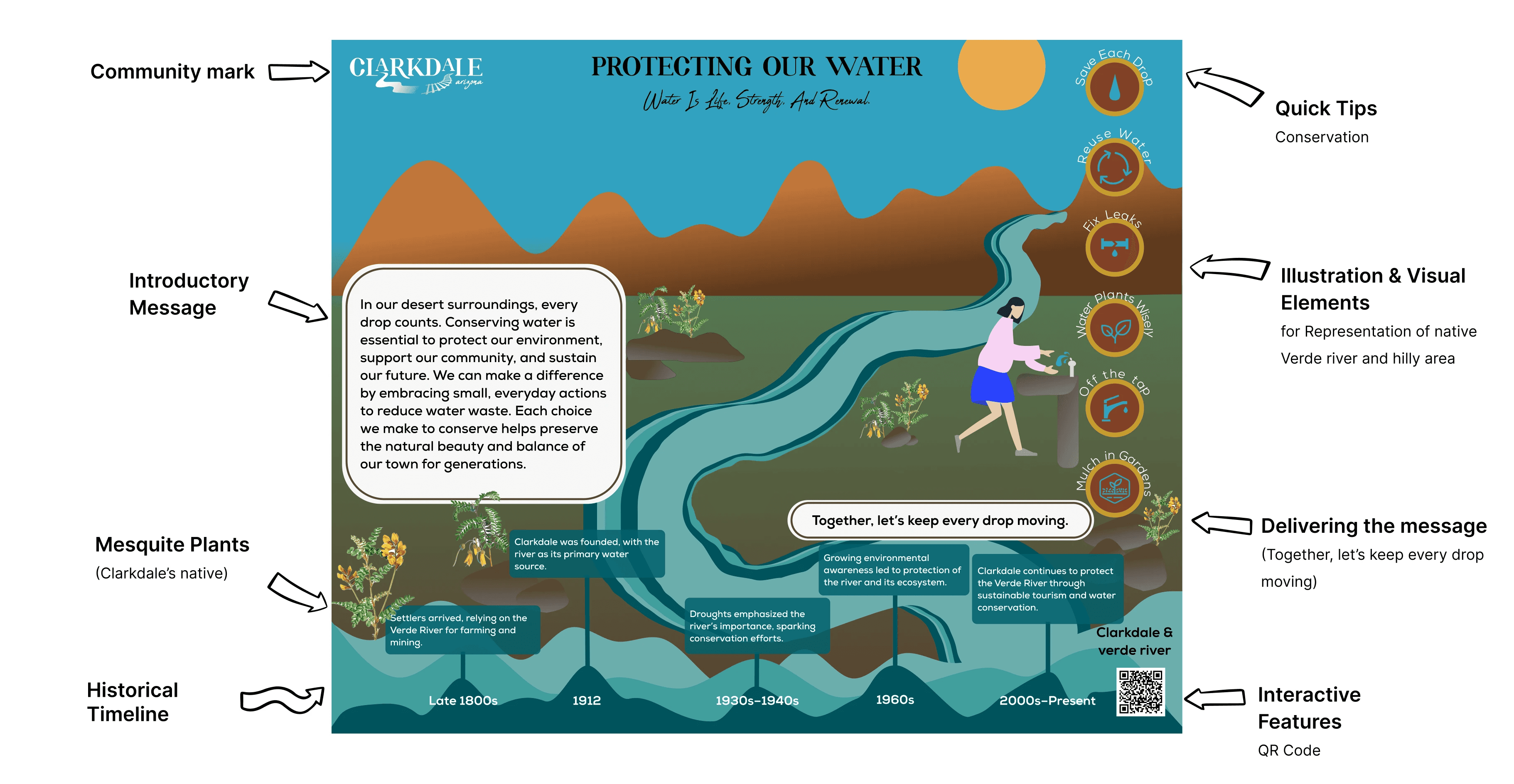
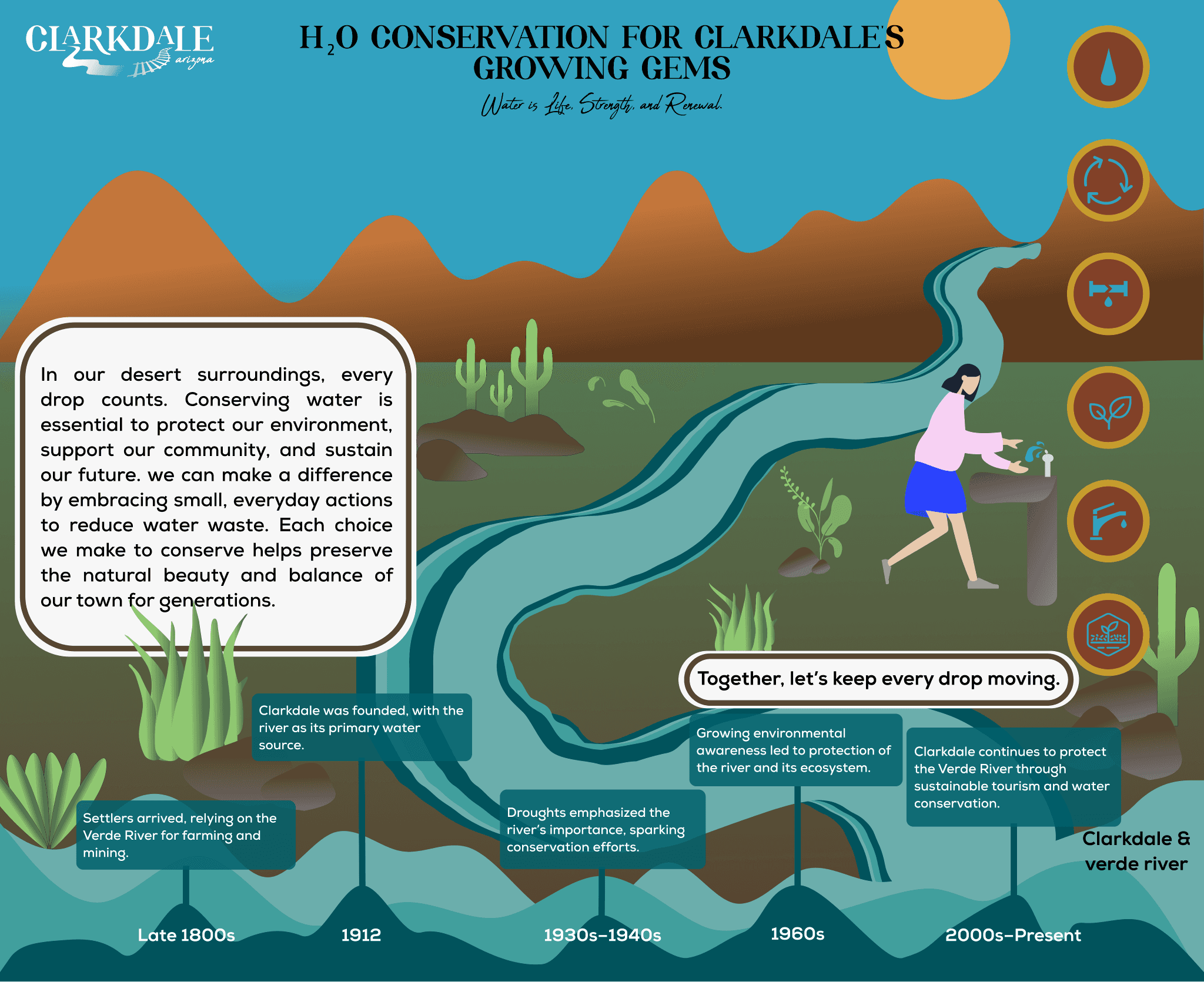
Final Design
Design I Delivered
Challenge
Clarkdale needed more than just signs;
they needed storytellers. The challenge was threefold
3
Create site-specific, accessible signage that inspires, educates, and connects everyone to the Verde River and the town’s environmental mission.
2
Create site-specific STEAM-based (Art's focused) educational content through Creativity.
1
Engage visitors with Clarkdale’s rich history and sustainability efforts.
Target Audience

Local families
children
eco-conscious visitors

Process - Agile UX Framework
Research & Requirements
Annotated Bibliography
I began by reviewing best practices in educational signage, accessibility, and community engagement, drawing insights from over 30+ articles and case studies.
Field Visit
A visit to Selna Mongini Park allowed me to map visitor flows, identify high-impact locations for signage, and observe how families interacted with the space.
Community Profile
Through my research, I discovered that families in Clarkdale value safety, environmental education, and community pride. Their focus on sustainability, water conservation, and reuse made it clear that park will be engaging, educational, and reflective of these shared values.


Design
Brand Guidelines
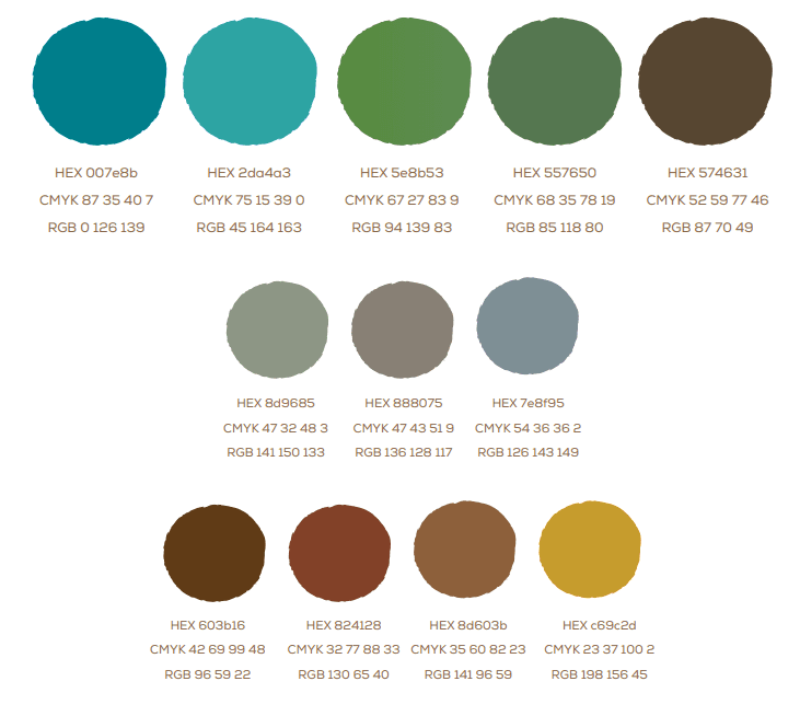
To ensure consistency, I worked within Clarkdale’s brand guidelines, focusing on six pillars: nature, history, local culture, vision, mission, and color.
Colors: Blues, greens, earthy reds, and copper, inspired by the local landscape.
Typography: Rolate for heritage, Abuget for taglines, Nexa for body text.


Development
Design Development
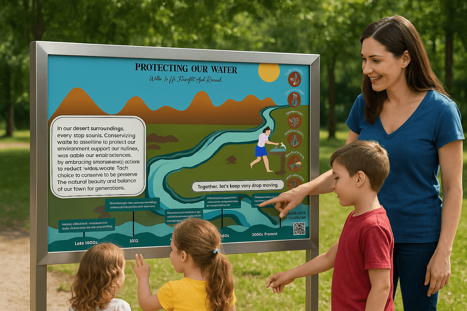
I sketched and prototyped interactive, family-friendly signs featuring:
• Vivid illustrations and icons
• Clear, approachable language
• An interactive water conservation timeline
• Stories and facts highlighting Clarkdale’s history and the Verde River’s importance
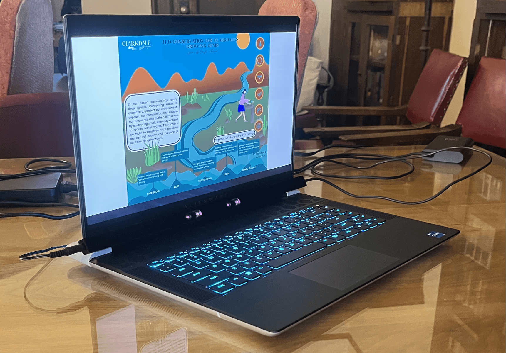
Testing
Evaluation
Using Tobii eye-tracking, I tested early prototypes with families and older adults. I measured:
• Ease of learning (clear titles, icons, and layouts)
• Navigation and content flow
• Accessibility (high contrast, large fonts, clean layouts)
• Durability and maintenance (weather-resistant materials, easy content updates)
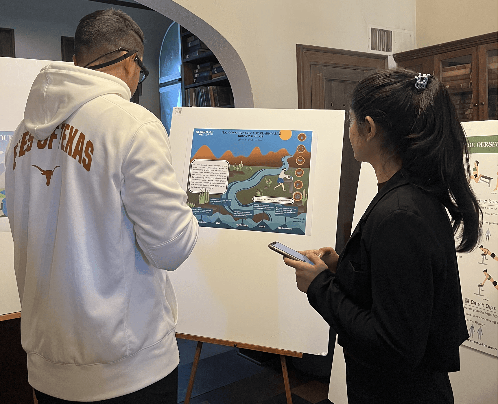
Iteration
Stakeholder feedback led to key improvements:
• New title: “Protecting Our Water”
• Native plant illustrations (mesquite instead of saguaro)
• Accessibility (tweak text & updated Typography)
• QR code attached to STEAM activities
Deployment
The final designs were presented to the Town of Clarkdale and will serve as a model for future STEAM focused public spaces blending art, education, and sustainability for generations to come.
Results
• Projected 35% increase in visitor engagement with the new signage
• 40% improvement in ease of learning, with faster comprehension and higher retention of key messages
• 60% accessibility compliance, reducing cognitive load and ensuring inclusivity
• 5+ years durability with sustainable, weather-resistant materials like aycralic board.
