Writing Analysis Tool
WAT Researcher Usability
ROLE
UX Researcher & UX Designer
Dates
Fall 2025
Duration
4 Weeks
Project Description
A desktop writing analysis tool, for large-scale text analysis. My role covered end-to-end UX: alpha testing and issue discovery, creating large datasets for stress testing, and running usability reviews and interviews with researchers.
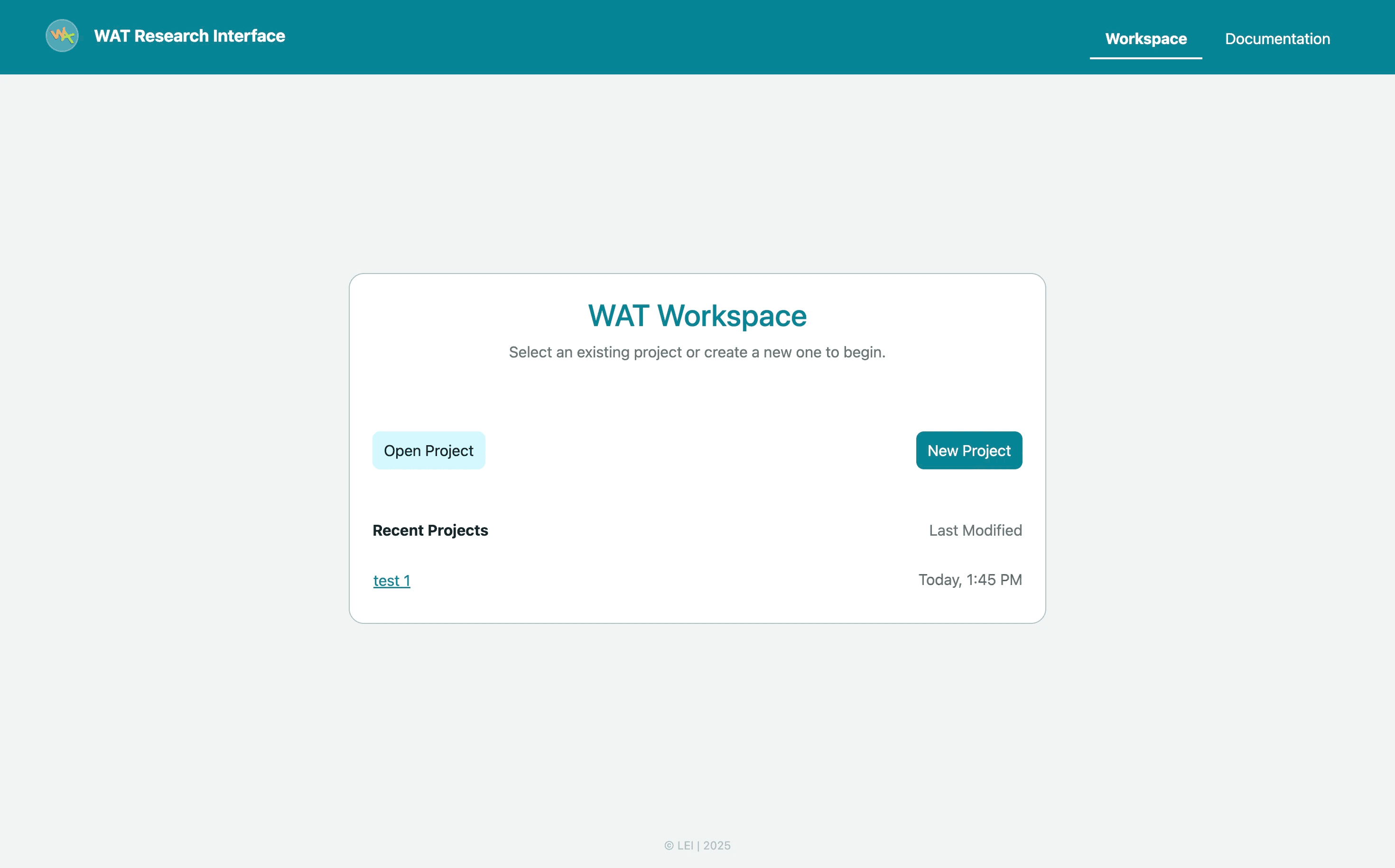
What is WAT Researcher?
WAT Researcher (Writing Analytics Tool) is a desktop app that helps researchers analyze large collections of writing (student essays, academic text, etc.).
It :
1
Takes in
Corpora
(sets of texts)
2
Extracts
2000+
linguistic features
3
Gives
Scores
based on writing genre
(Independent / persuasive, and Source‑based / dependent).
Alpha testing
I joined the project at the alpha testing stage and used the tool as a researcher and found UX issues, accessibility issues and functionality issues:
UX Isues
Change radio button menu switch to tab style switch for folder mode and table mode
Need to show Open Project Button Disable at the Initial stage
Responsiveness for select corpus table
Remove Footer
Show the current active Tab in NavBar
Checkbox to be replaced with radio button while selecting corpus
Change name from browse to select
tooltip for @textld and @text are required
create corpus modal - structured layout
Accessibility issues
Genre dropdown Icon
color contrast for modal
font size for table text
Corpora Modal Position needs some space from top
Functionality Issues
Analysis fails in CSV and XIsx for no source corpus
Cases where the system failed silently or without helpful feedback
tooltip
Then, I moved into problem‑solving mode, Worked with the team to fix problems and tested them again.
Stress testing
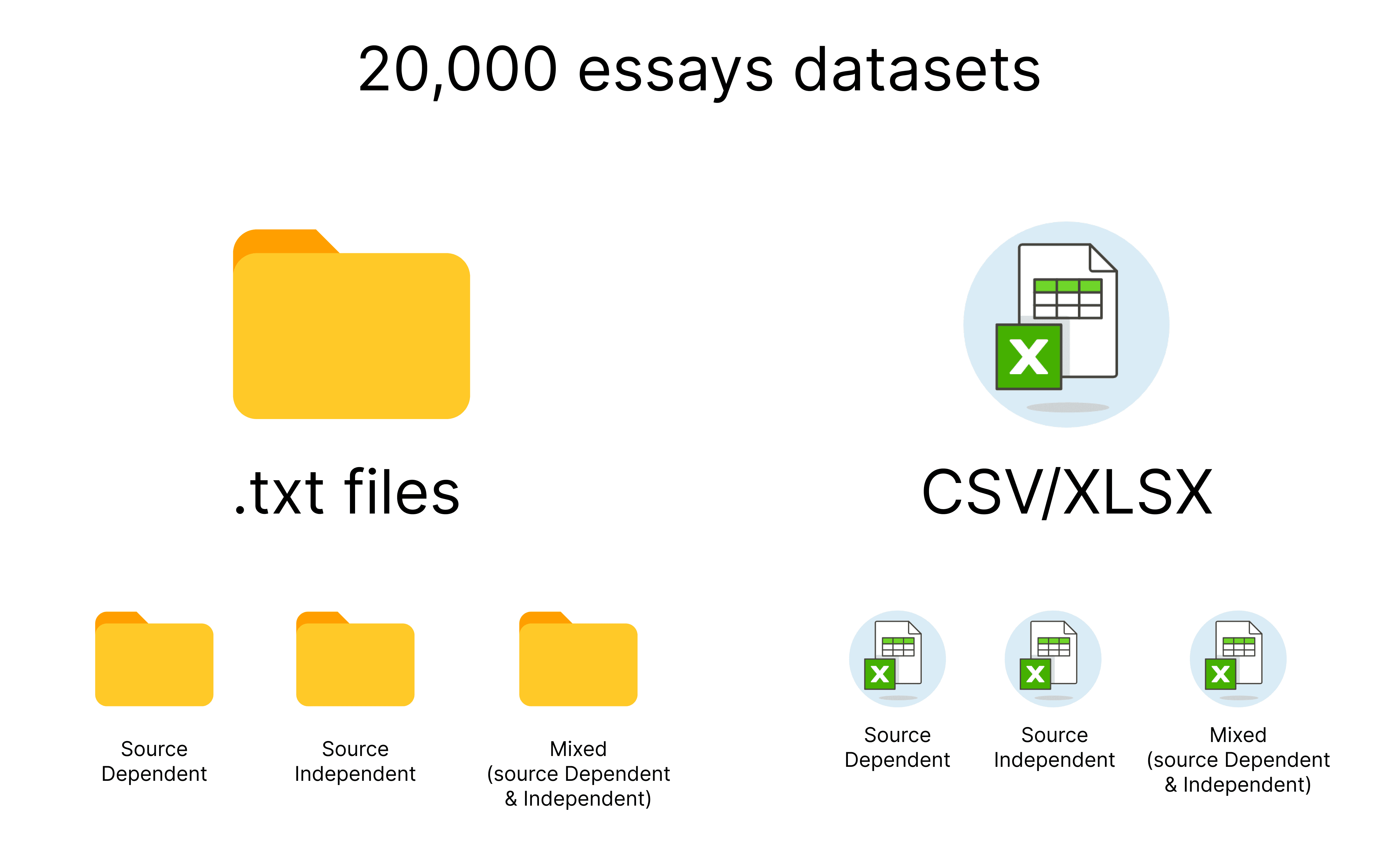
After alpha test, I thought Researchers might work with large texts.
So to perform stress test, I generated 20,000 essays datasets using ChatGPT, for Folder mode as .txt files and spreadsheet files (CSV/XLSX) including Source-dependent, independent and mixed types.
I wanted to see:
Does the tool still feel stable?
Does the progress make sense for long runs?
Do any new UX or performance issues appear only at scale?
I discovered that:
1
Only one analysis runs at a time
2
If something stops, data processed so far was lost
So I added some text blurbs to indicate user.
The next step was: “Now let’s hear directly from users.”
Usability Review
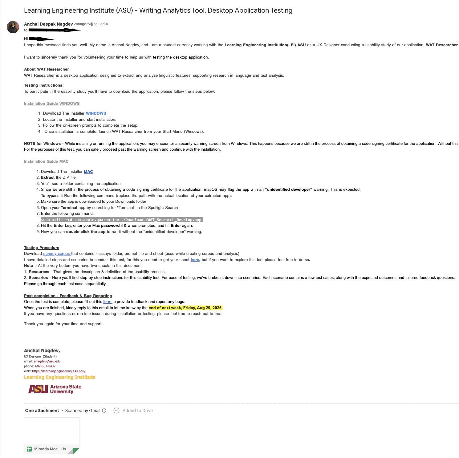
At this point, I felt internal testing wasn’t enough and I decided to run a usability review and collect input from more people.
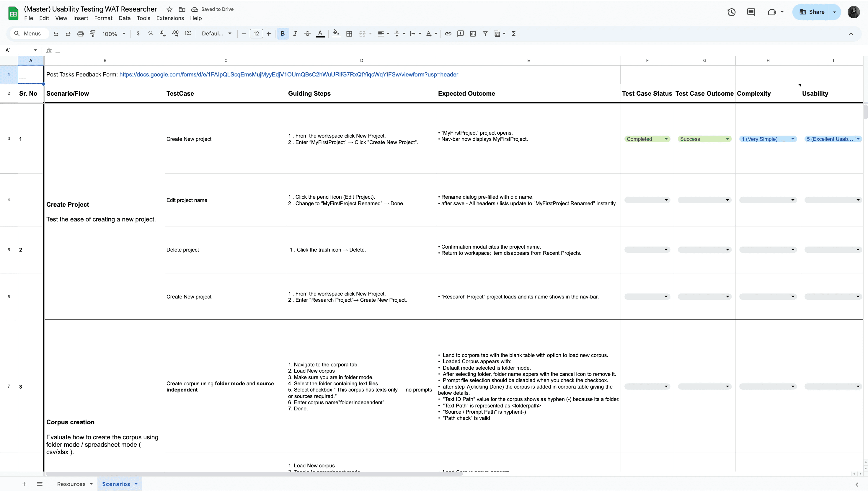
Sent an email to target users to try the tool and fill the form
Researcher Interviews
Then, I Planned and conducted 4–5 interviews with researchers who were potential users of WAT Researcher I Asked them to:
Explain how they currently work with writing data
Walk through key tasks in the app (project, corpus, analysis, results)
Share what made sense and what felt confusing
My goal was to understand
1
how they think about projects, corpora, and analysis
2
Where they hesitated or got stuck
3
What felt confusing
4
What they would expect from a tool like this
I got to know
Researchers preferred clear, direct language over technical labels.
They needed to see a simple mental model
Project → Corpus → Analysis → Results
Small misalignments between their expectations and the UI sometimes caused hesitation.
Results: Leadership, Improvements and Launching
After organizing everything, I prepared the findings and recommendations and sent them to leadership for review.
20% overall improvement was made and the product was Launched.
What I Learned
1
Issues appear at scale and with real user workflows.
2
Simple language helps.
3
Stress testing is a UX activity too. It exposes not just technical limits, but also how understandable the system is under pressure.
4
Logs, surveys, and interviews together give a fuller picture.
